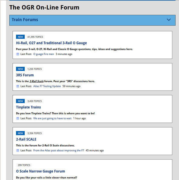
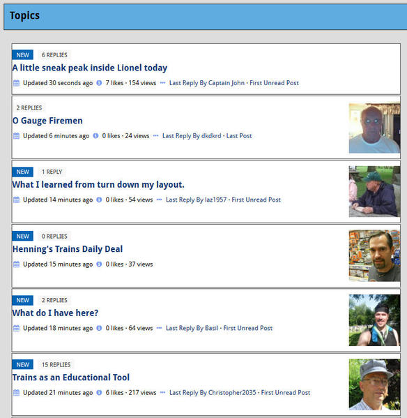
Thought I'd share a few of the CSS customizations we've made to our site which may be helpful to others, ...with the hope that a few of you would post your favorite customizations too. Please include your site's URL.  
(Would also welcome comments from Hoop if any of these need adjusting.)    

Our site: www.rotation.org   


/*hides # of views and bookmarks on a topic*/
.h-topic-metadata {
display: none;
}


/*makes "Current Visitors" profile pics widget bigger*/
.h-online-now-members .member-avatar {
width: 40px;
height: 40px;
}


/*adds the word "menu" below hamburger menu in mobile view*/
.tab-bar .menu-icon span::after {
content: "menu";
color: "#F6F7F8";
font-size: 0.95rem;
}

/*adjusts text "menu" under that hamburger icon*/
.tab-bar .menu-icon {
text-indent: -0.6rem;
}

(We had members who didn't know the 3 lines were a menu.


/*increase avatar from 50 to 65 in post BYLINE and hoping hoop will eventually move some of this layout around*/
.h-byline-avatar{
width: 65px;
height: 65px;
}


/*puts color around reply box to make it stand out*/
#postReplyContainer {
background-color: rgb(201, 210, 252);
padding: 8px;
}


/*removes the "follow forum" bar in forums view*/
#watchForumButton{display:none;
}


/* get rid of ALL CAPS in nav bar: */
.top-bar-section ul li > a {
text-transform:none;
}


/*turns breadcrumbs to Sentence Case instead of all uppercase*/
.breadcrumbs>* {
text-transform: none;
}


/*turns off uppercase in Activity Stream widget*/
.uppercase {
text-transform: none;
}
 

Replies sorted oldest to newest

Neil, I'll add to this.  Instead of the magnifying glass in the header, I have the word "SEARCH" spelled out.  Makes it more noticeable, IMO.  Here is the code:


/* turn icon into "SEARCH" in top header*/
.h-search i.fa {
font: inherit;
-webkit-font-smoothing: inherit;
-moz-osx-font-smoothing: inherit;
}
.h-search i.fa-fw {
width: auto;
}
.h-search i.fa-search:before {
content: "Search";
}

Bradley Blinn

Neil, I genuinely appreciate what you have done here. CSS is a little beyond my knowledge envelope and I really don't understand where to find the things to change, as you have done here.

I have used a couple of your custom CSS codes in our site, with a nice improvement in its appearance. I have run into one problem, however.

I have placed this code into our site:

.h-ubb-directory-forum-box {
background-color:#ffffff;border:1px solid #555555;padding:15px;
}
.h-ubb-topic-list-box {
background-color:#ffffff;border:1px solid #555555;padding:15px;
}

The directory-forum-box looks fine, and I can change its appearance by manipulating your code. It has nice margins all around and good spacing, like this:

Forum Directory Box


However, the forum's topic-list-box looks like this, and I can't seem to change it:

Forum Topic List Box

This page has no left margin for the text and the spacing between posts is too tight. I would like to make this page look like the directory-forum-box.

What am I doing wrong?

Attachments

Images (2)
  • Forum Directory Box
  • Forum Topic List Box
Rich Melvin

Hi Rich. Please post your site's url.


topic-list-box needs "padding" inside the container:

Here's what we're using:

.h-ubb-topic-list-box {
background-color:#DEDFE0;
border:1px
solid #DEDFE0;
padding:10px;
}

UPDATE:  
I looked at your page with Inspector and see why my CSS didn't change your page. You have two entries for the topic list box. The first has your new padding, the second still has the original padding (which in this screenshot, when I unclicked/turned off the padding line, your page padding 15px worked.)

off

In other words: remove padding: 10px 0 10px 0 !important;   --from your css and the other entry you have for .h-ubb-topic-list-box with the padding will work. (or combine the two into one entry would be nice too)

I do not know why it is marked "important" because I've had it off for two months with no ill effects.  BTW: 10px is sufficient.


The How-to:
I turn on Chrome's built in "Inspector" to view the CSS which is controlling whatever element I've highlighted on the webpage. (I place my cursor over the element on the site, then right click and select "inspector). Up pops a window with the html and the css source which I can then experiment with by toggling on/off or adjusting/adding styles. You can also add a style to an element and test it. When I get it right, I copy the style and paste into my site's Custom CSS field.  Trial and error.  

Sometimes the hard part is isolating the specific element so that you don't apply changes to unintended text. (For example: in our Activity Stream it took me several tries to turn off 'bold' in part of the stream but not all of it.)

Rather than create from scratch, it's much easier to view a feature you like on someone else's site and copy their code to try it out/modify it.  That's why I think all of us working with Hoopla would be wise to share our sites with each other so we can look over each other's shoulders and swap code.  

FYI:  I'm not a trained CSS guy. Just been working with websites since 1996 and pretty good at figuring things out (or asking for help).

Neil
www.rotation.org


Attachments

Images (1)
  • off
neil
Last edited by neil

Add Reply

×
×
×
Link copied to your clipboard.
×