Tomorrow, we are rolling out a major new update for Crowdstack that focuses on making the experience more "social." We're adding a new feed that allows you to view and react to complete posts, as described here:
https://hey.crowdstack.com/blog/the-feed
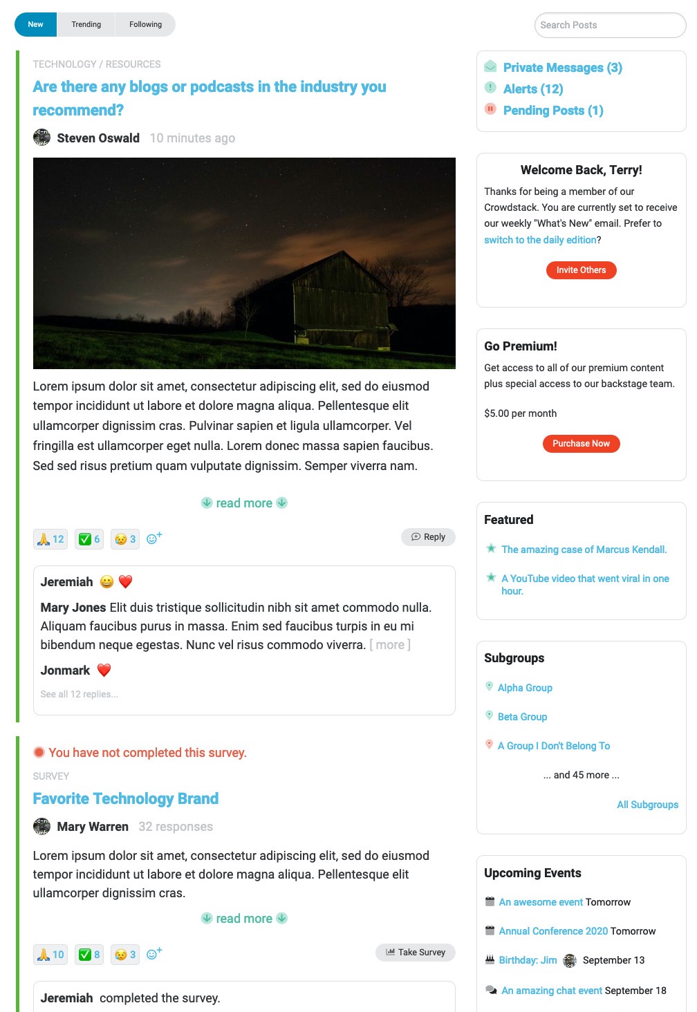
Here's a screenshot of a sample site:

The new home page for Crowdstack will be taking a huge leap forward, with an experience that will be familiar to anyone familiar with major social networks. Live updating means that you will be notified about new posts to the Crowdstack as you browse the page. Indeed, the new "feed" is designed to be the primary way that you and your people consume content.
The new "interaction box" below each post displays the most recent reactions/comments to the post.
The widgets on the new Home page are smart and will always reflect the particular content you have configured for your stack. Included in this new widget set is a widget to promote your premium membership, if enabled.
Subgroups also use the new Home page design.
(If you are still on our legacy Version 1, this change will not apply to you.)
But wait, there's more! We've made these changes, as well:
Terminology Changes
We've renamed "Forums" as "Topics" and "Clips" as "Resources." In addition, "Support Topics" are now "Support Tickets."
If you are not a fan of the new terms, you can always change them to whatever you like. Just go to Manage > Settings > Areas and update the name in that content type's settings. (You may also want to check/change other wording references for the name in Manage > Settings > Design > Wording.)
Posting Events and Private Messages
We've sandboxed the posting action for calendar events and private messages so that they are not including in the general "post" button. Rather, if you wish to add a new event or private message, you will need to visit the respective page (calendar or private message area) to do so.
(If you are still on our legacy Version 1, this change will not apply to you.)
Reactions Now Sorted by Popularity
On posts, we now sort the reactions that have been made by popularity, such that the reactions that have been used the most will be shown first in the list.
 Theme Improvements
We've streamlined a couple of theme colors for consistency. For the "Default Content" area of the Theme, you'll notice two new colors- Positive Font Color and Negative Font Color. The positive font color is used to indicate a positive state or event (like when a member is "online") and the negative color is used to indicate an incomplete, unavailable, unused state. For instance, we use the negative color on the new Home page to indicate that you have not yet completed a survey.
There were numerous other minor changes, improvements, and bug fixes. Look for this to be rolled out sometime tomorrow (September 24th).
Remember, if you are still on our legacy (Version 1) Crowdstack system, you can move to the current version (with all of these improvements) anytime (at no additional cost). We encourage everyone to come on over!
If you have any questions, please post to us on our support site or email us at [email protected]. Thanks!


Comments (0)