Today, we have begun the process of rolling out a major update for Hoop.la sites.  This upgrade focuses mainly on the forums module.

Let's go over the changes!

1. New Topic List Mode

In your control panel for the UBB Forum module, you'll see a new setting that looks like this:

Screenshot 2019-05-08 08.55.56

The "New" topic list mode focuses on making it faster and easier for your members to browse through topics in your community. There is no separate list of categories and forums in this mode. Instead, all forums and/categories are listed above the topic list, serving as a filter of the list.

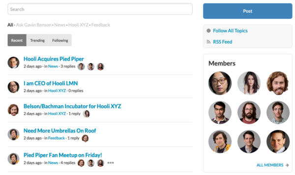
Here's what the new mode looks like:

Screenshot 2019-05-08 08.57.12

As you can see, in this mode, there is a prominent search bar, a list of all forums, and three different topic list tabs- Recent, Trending, and Following. Following includes only the topics the member is explicitly following. For each topic in the list, we display profile pictures of the last 3 members that replied.

The "new" mode also utilizes infinite scroll, rather than pagination.

It's a much cleaner, simpler (and more powerful) way to browse forum topics. But of course, if you prefer the old way, just keep yourself in Legacy mode. Existing sites will still be in "Legacy" mode, so you will not see any changes associated with the new model unless you decide to switch to the "New" mode.

2. Post Button Now Viewable By Guests

The big "Post" button displayed at the top of the widget column is now always visible, even to guests (people not signed into your site). If a guest clicks on the button, they will be queried to sign in or register.

3. New Theme

We've added a new theme called "Charleston". Aside from the new theme, we've also spruced up our base CSS a bit. Much of it is adding more rounded edges to things. You may notice these changes on your own site, depending on the amount of custom CSS that you have added. If our changes put a crimp on your own style in some way, create a support ticket here and we can help you get things the way you want them.

4. New Primary Community Logo and Simple Header Option

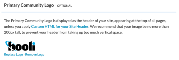
A new, optional General Settings field is "Primary Community Logo"

Screenshot 2019-05-08 08.58.52

The primary logo is automatically displayed in the site header, when using a Simple Header. The "Custom HTML" site header option remains for customers that want to display more than a single logo in their header. If you are an existing customer, you probably do not need to use the new field, because you have already created your site header.

5. New New Approach To Default Member Avatars

Previously, we displayed the same generic profile image for members who did not supply a profile picture. We've improved things quite a bit on that front by instead assigning a color and initials for each avatar-less member. Thus, you'll see a colored circle with one or two letters inside the circle representing the member's name.

6. Sticky Header for Forum Topics

This is a featured we borrowed from our QuestionShark support topics. When you scroll down on a forum topic, the forum title will remain sticky at the top of the page.

7. Removal of Google+ from Social Networks

Now that Google+ has ceased to exist, we have removed support for that Social Network.

As usual, there are numerous other bug fixes and minor changes associated with this major update. If you experience any issues or have any questions, please let us know.

Note: it may take a week or so for us to deploy this update to all customers. Pro/Enterprise customers will be the last to receive the update.

Attachments

Images (3)
  • Screenshot 2019-05-08 08.55.56
  • Screenshot 2019-05-08 08.57.12
  • Screenshot 2019-05-08 08.58.52
Tags: Forums, Themes

Add Comment

Comments (17)

Newest · Oldest · Popular
@Julie Usher posted:

If we change to the new forum display mode and don't like it, can we change back to legacy mode with no loss of information or data or formatting? Assuming so, but wanted to check before I do anything that might cause me more work. Thanks!

I have not been here for a couple of years. Someone else I have given our Forums to. I am also wondering if there is a way to switch back to the older style.

https://guyana.crowdstack.io/home

Where each topic was listed line by line for each sub forum. Rather than having it the way it is now.


Thanks

Amral Khan

ST- Please post to the support site if you'd like assistance with your site.

@ST - the page you provided the screenshot for is your HOME Page. The settings I referenced are for the FORUMS page.  Two different things. 

But again, I think it will be better for you to post your questions to support so that we can ensure that you get the best possible assistance.

Thanks!

Ted @ Crowdstack
Last edited by Ted @ Crowdstack

1. New Topic List Mode

In your control panel for the UBB Forum module, you'll see a new setting that looks like this:

Screenshot 2019-05-08 08.55.56

The "New" topic list mode focuses on making it faster and easier for your members to browse through topics in your community. There is no separate list of categories and forums in this mode. Instead, all forums and/categories are listed above the topic list, serving as a filter of the list.

Here's what the new mode looks like:

Screenshot 2019-05-08 08.57.12

As you can see, in this mode, there is a prominent search bar, a list of all forums, and three different topic list tabs- Recent, Trending, and Following. Following


I don't see these (bold above).

Here's what I see.

Social Strata New Layout Missing items

Here are my home page settings.

ST

Attachments

Images (3)
  • mceclip0
  • Social Strata New Layout Missing items
  • mceclip1
ST
Julie Usher posted:
ST posted:

6. Sticky Header for Forum Topics

This is a featured we borrowed from our QuestionShark support topics. When you scroll down on a forum topic, the forum title will remain sticky at the top of the page.

The Sticky at the top of the page feels too large, and you lose the context of the discussion.

Suggestion.

Instead of this:

Continue to display the breadcrumbs like this.

Socal Strata breadcrumbs instead of subject sticky

That is: Make the breadcrumbs sticky.

ST

I agree. I used the CSS to suppress the sticky title because it took up too much of the screen, making it hard to follow the content.


Hi Julie,

Would you mind sharing the CSS you used for this. It will save me a lot of time.

Thanks,

ST

ST

2. Post Button Now Viewable By Guests

The big "Post" button displayed at the top of the widget column is now always visible, even to guests (people not signed into your site). If a guest clicks on the button, they will be queried to sign in or register. 

Love this!  It saves me the time it takes to explain to guests, how to reply to a post (e.g., at top right click join etc.).

Thank you!

ST

ST

More on the Sticky Header.

Basically - I appreciate the intent but as it stands, it's pretty jarring when you scroll down.  As I mentioned, I'd prefer to keep the context provided by the breadcrumbs, but even if you can do that, how do I solve this.


Before the scroll.

Once you scroll down far enough to trigger the sticky topic the background of the sticky extends across the width of the window, and you get this.

ST


Attachments

Images (2)
  • mceclip0
  • mceclip1
ST
ST posted:

6. Sticky Header for Forum Topics

This is a featured we borrowed from our QuestionShark support topics. When you scroll down on a forum topic, the forum title will remain sticky at the top of the page.

The Sticky at the top of the page feels too large, and you lose the context of the discussion.

Suggestion.

Instead of this:

Continue to display the breadcrumbs like this.

Socal Strata breadcrumbs instead of subject sticky

That is: Make the breadcrumbs sticky.

ST

I agree. I used the CSS to suppress the sticky title because it took up too much of the screen, making it hard to follow the content.


JU

6. Sticky Header for Forum Topics

This is a featured we borrowed from our QuestionShark support topics. When you scroll down on a forum topic, the forum title will remain sticky at the top of the page.

The Sticky at the top of the page feels too large, and you lose the context of the discussion.

Suggestion.

Instead of this:

Continue to display the breadcrumbs like this.

Socal Strata breadcrumbs instead of subject sticky

That is: Make the breadcrumbs sticky.

ST

Attachments

Images (3)
  • mceclip0
  • Socal Strata breadcrumbs instead of subject sticky
  • mceclip1
ST

In the topic display, there's now a bar that shows the topic title as soon you scroll down. It appears with a white background, which doesn't look good on one of my sites. However, I can't find how to style it to have a black background in the theme editor.

I can look into custom CSS myself, but isn't this available as a style option?

Slaz
Last edited by Slaz
×
×
×
Link copied to your clipboard.
×