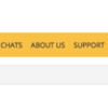
By default, the main navigation menu is displayed ABOVE your site header. It is also full width by default, like so:
Below, we will offer some tips for changing the appearance and positioning of your main nav menu.
Left Align The Menu
To position your menu text so it is aligned left instead, add this CSS:
nav#top_nav_bar ul.right { float:left !important; }
nav#top_nav_bar ul.right > li > ul.dropdown {
  left: 0;
  right: auto;
}
Your menu will then look like this:
Center Align The Menu
To position your menu text so it is aligned center instead, add this CSS:
nav.top-bar {
  text-align: center;
}
section.top-bar-section > ul.right {
  float: none !important;
  display: inline-block;
}
.top-bar-section .dropdown li { text-align:left; }
.top-bar-section .right li .dropdown { left:0; right:auto; }
Your menu will then look like this:
Note that we only recommend applying this centering CSS if the menu content is not longer than 1024 pixels. Otherwise, there may be wrapping issues.
Remove Menu Dividers
By default, the menu will display a divider line between each icon in the horizontal menu. There is also a divider in some vertical submenus to separate main sections. To prevent the display all of the menu dividers, use:
li.divider { display:none; }
To hide only the dividers in the top nav horizontal menu, use:
.h-horizontal-divider { display:none; }Or to hide only the dividers in the top nav menu vertical submenus, use:
.h-vertical-divider { display:none; }Display Menu Below Your Header
By default, the menu is displayed at the very top of all pages. This is recommended because the off canvas menu will always be pinned there, but you can easily move the position below your site header.
Go into your admin control panel, here:
Admin Control Panel > Design > Display Settings
In the Site Header section on that page, you'll see these options:
Set it to "Display Above Main Nav".
Your navigation menu will then look like this:
Constrain Width To Content Column
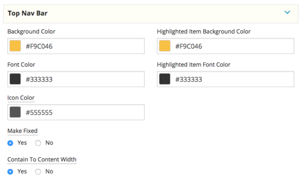
By default, the menu content will fill the full width of the browser window. However, the content column is only 1000 pixels wide. If you'd prefer to limit the length of the menu content to be no wider than your page content column, then you'll need to select the "Contain To Content Width" option for the Top Nav Bar section of your theme, as shown below.
Note that this only impacts the menu content. The overall menu wrapper is still set to be full width (and background color). See next tip to limit the width of the entire menu wrapper.
Limit Background of the Menu
Even if you constrain the menu to the content width, that will only impact the menu content, not the entire background of the menu. If you do not wish to have the menu background color span the full width of the page, then you'll need to apply some CSS to limit the width of the entire menu wrapper.
Apply this CSS:
#top_nav_bar_wrapper {
width:1000px;
margin:auto;
}
Note that setting that at 1000px may not match the width of your header. In fact, unless you collapse your header grid, you may want to use a narrow width, like so:
#top_nav_bar_wrapper {
width:970px;
margin:auto;
}
Now we have a menu that only extends the width of our content below it, as shown below.
One final important piece, though...
If you are displaying your menu BELOW your header AND if you have your TOP NAV set in your theme to be fixed (the "Make Fixed" setting), which is the default behavior, then you will want to add the following CSS, as well:
#top_nav_bar_wrapper.fixed {
width:100%;
}
Without that CSS, your menu will look like this as you scroll up:
But with that CSS, your menu will look like this instead as you scroll up:
Much better!


