Crowdstack uses a responsive grid to make sure that interfaces can automatically adapt to different screen and device sizes. We use Foundation's responsive system.
Most of the time, you do not even have to worry about that. But there are a few areas where you really need to be cognizant of the overall page structure and responsive and those include your header, footer, and top banners that are displayed at the top of the page.
Each of those items is full-width by default and so they will not be constrained by our normal 1000 px page content width.
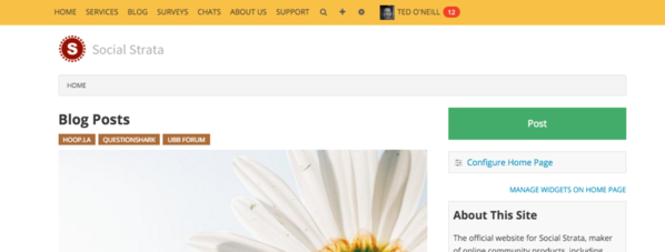
Here's an example of our own Site Header, when we add our logo by itself:
Here's our simple HTML code for that header:
<a href="https://hey.crowdstack.com">
<img src="https://hey.crowdstack.com/ws/social-strata-logo-200x50.png" />
</a>
Notice how the logo is all of the way over to the left, displaying the full width of the page. Now, some sites may want their headers this way... but we want ours to be aligned within the 100px width of the content below it.
Thus, we will add a very basic responsive grid around our logo, like so:
<div class="row">
<div class="small-12 columns"><a href="https://hey.crowdstack.com">
<img src="https://hey.crowdstack.com/ws/social-strata-logo-200x50.png" />
</a></div>
</div>
After adding that, our header looks like this:
Much better!
Thus, whenever you add a Site Header, Site Footer or Top Banner (assuming you display the banner at the very top) you will usually want to include this basic responsive grid wrapper.
I won't go into the details of what it means, but if you click on the Foundation link above, you can read all about grids and advanced use cases, as well.


