The theme editor allows you to customize the overall background color for your widgets.
Here's a typical widget styled using the the theme editor only:
Change Title Font Properties
If you just want to change the widget title's font size, color, or weight (how bold it is), apply CSS like this (setting your own specific colors, sizes, weights):
header.widget-header h3 {
  color: #4d709f;
  font-weight:400;
  font-size:1.1rem;
}
Note that you should be using REM units for font size, not pixels. That way, your font sizes will be responsive (adjust depending on screen size). Once you've made this change, your widget will look like this:
Apply Background Color To Widget Title
If you would like to apply a different background (and text) color to the widget, add this CSS:
/* first remove padding from widget box: */
.widget-box { padding:0; }
/* set padding/margin for header row and apply background color: */
 header.widget-header{
    padding:10px;
    margin-bottom:10px;
    background-color:#4d709f;
}
/* apply custom font color to the title, if necessary...
or change weight of font: */
header.widget-header h3 {
  color: #ffffff;
  font-weight:400;
}
/* apply padding to widget body in general */
.h-widget-body { padding:10px; }
You will want to swap out the background-color and/or text color hexidecimal color codes to match whatever color you want to use.
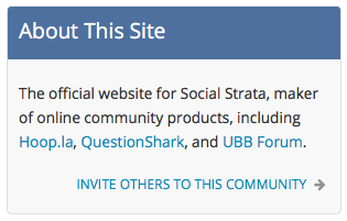
After adding that CSS, your widget looks like this:
Apply Rounded Corners
If you want your widget to have rounded corners, you'll want to add some CSS to the .widget-box and the header.widget-header, like so:
.widget-box {
    border-radius: 5px 5px 5px 5px ;
}
header.widget-header {
  padding: 5px 10px 5px 10px;
  border-radius: 3px 3px 0 0 ;
}
Now your widget will look like this:
Change Border Style For Widget
By default, the border you set in your theme for your widget will be applied as as a solid 1 pixel in the color you define. However, you can change that border presentation using CSS.
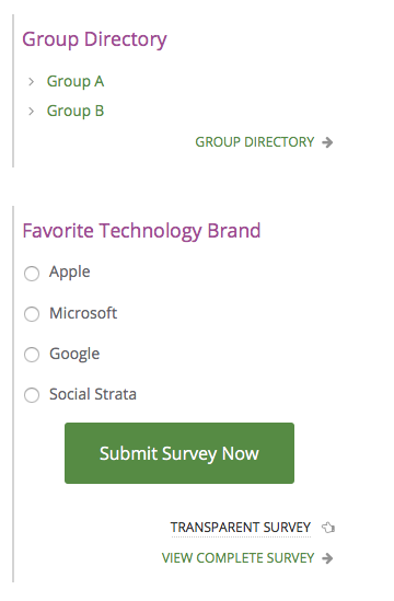
For instance, here is code to override the default border style by setting a thicker border only on the left side of the widget. We'll also add some more margin to the bottom of the widget so that the lines do not appear to run together.
.widget-box {
   border-left: 2px solid #d4d4d4;
   border-right:none;
   border-top:none;
   border-bottom:none;
   margin-bottom:35px;
}
Here's what our border-left-only widget looks like:
Hopefully, you can see how easy it is to slightly tweak the example above to set a top-only border or a bottom-only border, as well.

